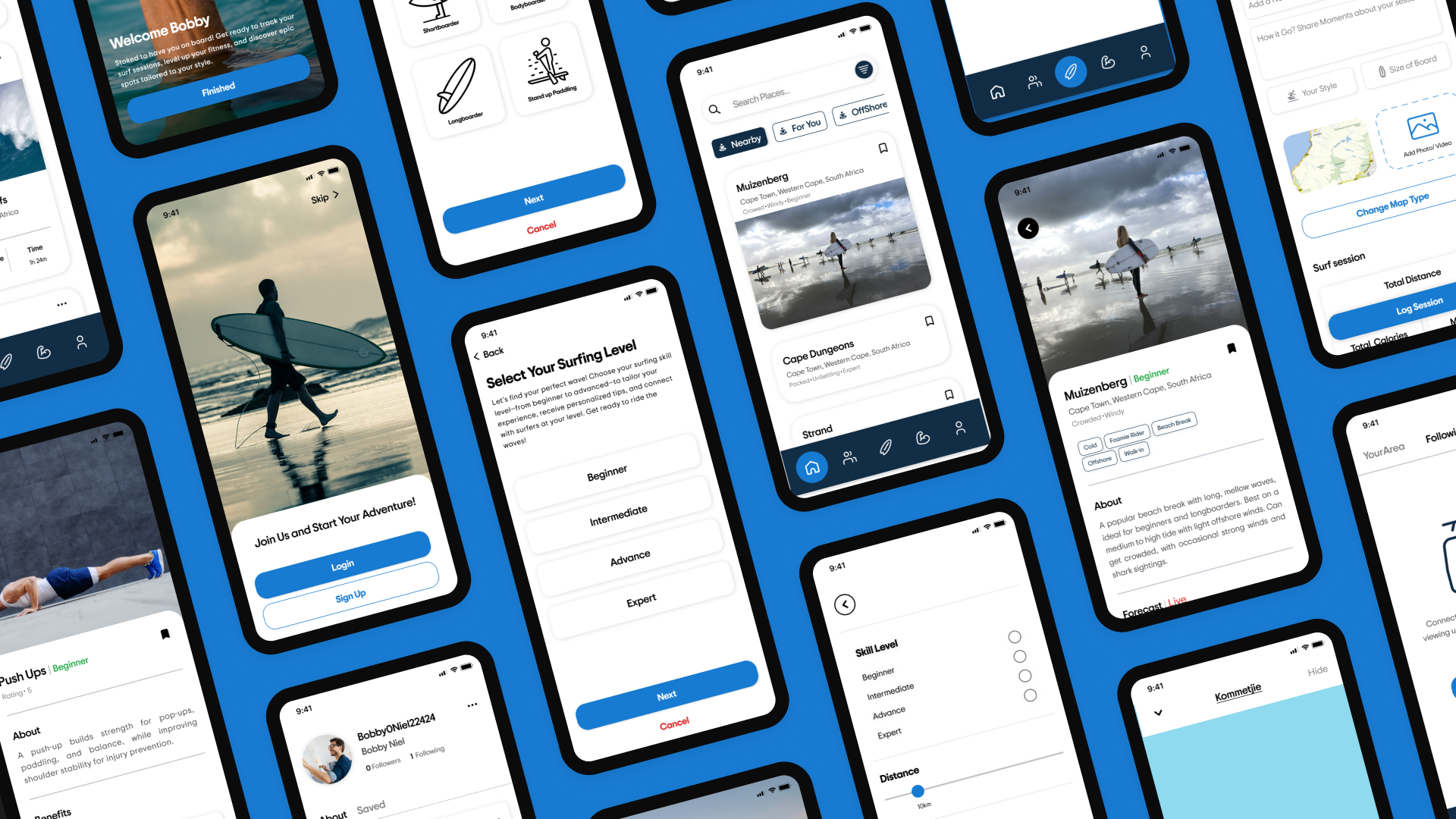


I started designing a fitness app for surfers. Research told me surfers had a more urgent problem: deciding where and when to surf.
So I changed direction. Personalized surf discovery became the core of the product, and surf-specific fitness became a supporting feature rather than the headline. This page is mostly the story of that decision.
01 — Design Brief
What Am I Designing?
This 8-week module teaches students to design a health, fitness, or wellness app using user-centred design and insights from AI and machine learning. It covers user research, competitor analysis, and creating personalised, intelligent experiences.
Eddy is combines fitness and community for surfers. Users can share sessions, track progress, and connect. AI-driven training plans and surf spot recommendations adapt to user skill and goals through Machine Learning
- A health, fitness or wellness product
- A user-centred design process, evidenced
- AI/ML explored as a personalisation layer
- Research, competitor analysis, testing
- Survey design and analysis
- Interviews and personas
- Problem definition and prioritisation
- IA, flows, wireframes, UI, prototype
- Usability testing and iteration
02 — Approach
How Did I Approach the Problem?
I took a user-centred approach, combining quantitative and qualitative research to understand how surfers of different experience levels approach fitness, performance, surf conditions and community. I used surveys to identify broader patterns and interviewed both an experienced and less-experienced surfer to understand their individual experiences in more depth.
The findings from these different research methods were then used to identify problems, generate ideas and prioritise features. This allowed the direction of Eddy to evolve from a primarily fitness-focused concept into a more personalised experience centred around surf discovery, performance and community.
03 — Research
What did I discover?
I did a survey of 12 surfers across ability levels. Two interviews gave me the depth: one developing surfer, one experienced surfer with very little free time. Alongside that I audited existing surf and fitness apps, and looked at how other products use AI and machine learning to personalise.
Who are the users?
To understand the needs of surfers, I created two personas based on research. The primary persona, E-Dawg, is a 22-year-old social media manager and university student who struggles to track progress and improve consistently. The secondary persona, Bobby, is a 43-year-old construction worker who has limited time to surf and train. These personas helped guide the design process and ensure that the app met the needs of its target users.
Primary

E-Dawg, 22
Pain Points
- Struggles to track progress & improve consistently
- Doesn't always know where to surf based on conditions
- Wants to build strength but lacks a surf-specific training plan
Needs
- Improve surfing technique & stamina
- Find good surf spots that match his skill level
- Connect with a local surf community
Secondary

Bobby, 43
Pain Points
- Has limited time to surf & train
- Finds it harder to maintain fitness with age
- Wants quick, surf-relevant workouts without overcommitting
Needs
- Stay in surf shape despite a busy schedule
- Get quick updates on the best local surf conditions
- Maintain technique & flexibility with minimal effort
Three findings that changed the product
Both interviewees described the same daily uncertainty: not knowing which spot suits them in today's conditions.
So skill suitability and conditions had to be answered on the first screen, not buried in a spot page.
Fitness interest was real but conditional — most did no surf training, and most would consider it if it were structured for surfing.
So fitness earns a place in the product, but as a supporting feature, not the reason to open the app.
Surfers already ask other surfers. Recent local sessions are the trusted signal.
So community activity became part of discovery itself rather than a separate social tab.
04 — Defining Problems
What problems did I identify?
Surfers often struggle to determine which surf spots are suitable for their skill level and current conditions, making it difficult to confidently decide where and when to surf.
Surfers lack simple ways to track their sessions and turn their surfing activity into meaningful insights that help them improve.
Surfers have limited ways to share recent sessions and connect with their local community when deciding where to surf.
Surf-specific fitness became a supporting opportunity rather than the core product focus, allowing the research to guide feature prioritisation.
05 — Ideation
What solutions did I explore?
Before committing to a direction, I opened the problem out into five broad opportunity areas, then weighed each one against the strength of the evidence behind it rather than which one seemed most exciting to design.
This became the core of Eddy, with performance carried forward as a supporting feature rather than the starting point.
How I prioritised
06 — Design Process
How did I turn ideas into an interface?
Everything below serves one sentence: the app has to answer "is this a good place for me to surf today?" before it asks the surfer to do anything else.
Information architecture
The flows that mattered most
The colour and type system had to work in bright sun or on a foggy screen, and stay calm enough not to compete with surf photography. Ocean blue carries the brand and marks the active state on the map; deep navy holds the interface's dark surfaces, like the bottom navigation.
Open Eddy → Recommended spot → Check conditions → View spot detail → Decide: surf or not.
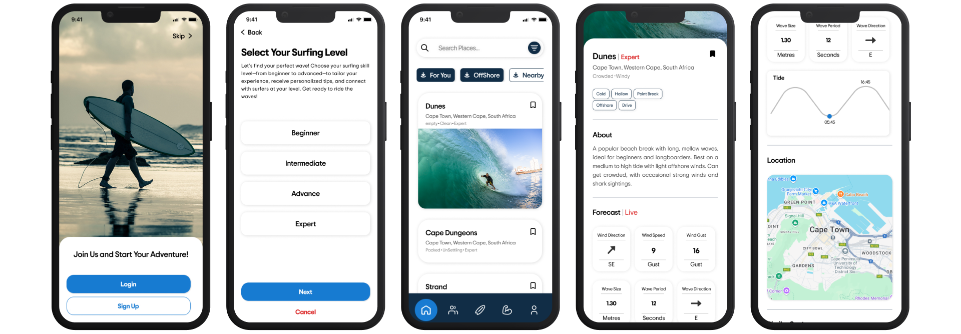
Open Eddy → Recommended spot → Check conditions → View spot detail → Decide: surf or not.
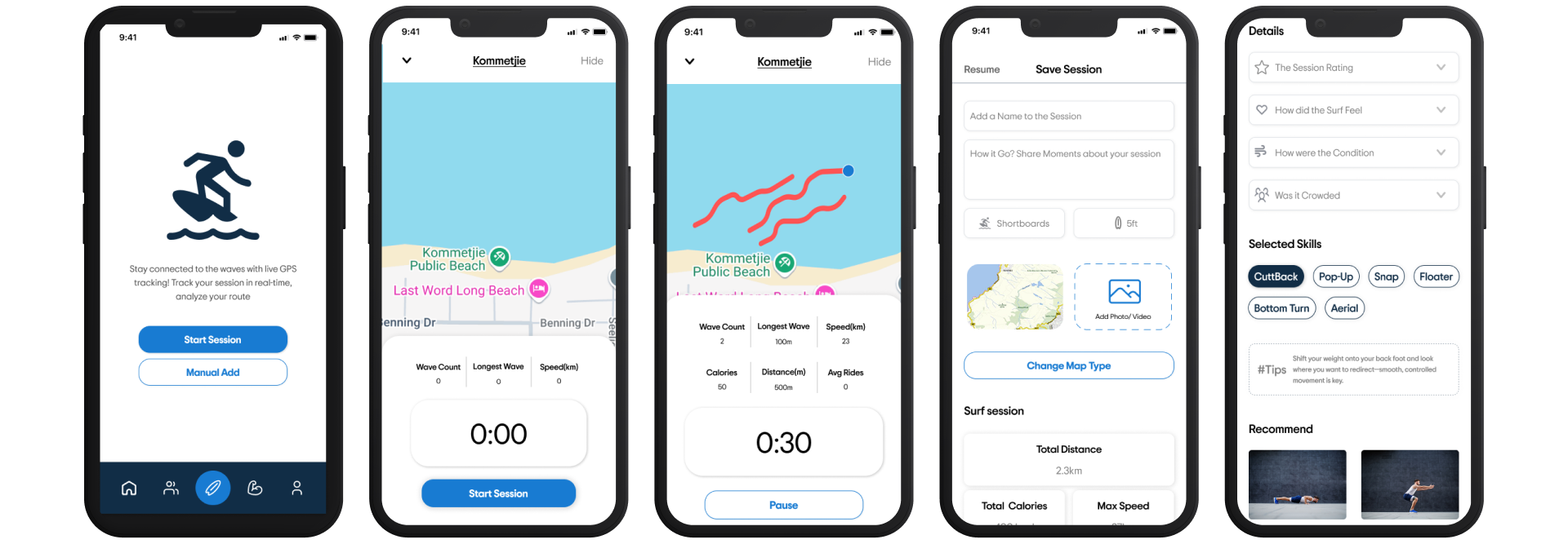
Three interface decisions
Surfers could read the numbers but not the verdict — swell, period and wind mean little to a developing surfer.
Decision Lead every spot with a plain-language suitability line for that surfer, and keep the raw conditions underneath for those who want them.
Recent sessions from local surfers were described as more trustworthy than a forecast.
Decision Put community activity inside the spot card instead of in a separate feed, so social proof arrives at the moment of the decision.
Testers found some screens dense — too many things competing to be read first.
Decision Cut secondary metrics from the first view and let one recommendation lead, with detail one tap away.
Eddy is a prototype, not a trained model. What I designed is the interaction such a model would make possible.
Inputs it would use: skill level, board type, previous sessions, stated goals, live surf conditions and nearby community activity. What the surfer would see: "This spot may be too advanced for you today." "This matches your surfing style."
Visual System Choice
The colour and type system had to work in bright sun or on a foggy screen, and stay calm enough not to compete with surf photography. Ocean blue carries the brand and marks the active state on the map; deep navy holds the interface's dark surfaces, like the bottom navigation.
font that was chosen was trip sans
07 — Final Design
What does the final design look like?
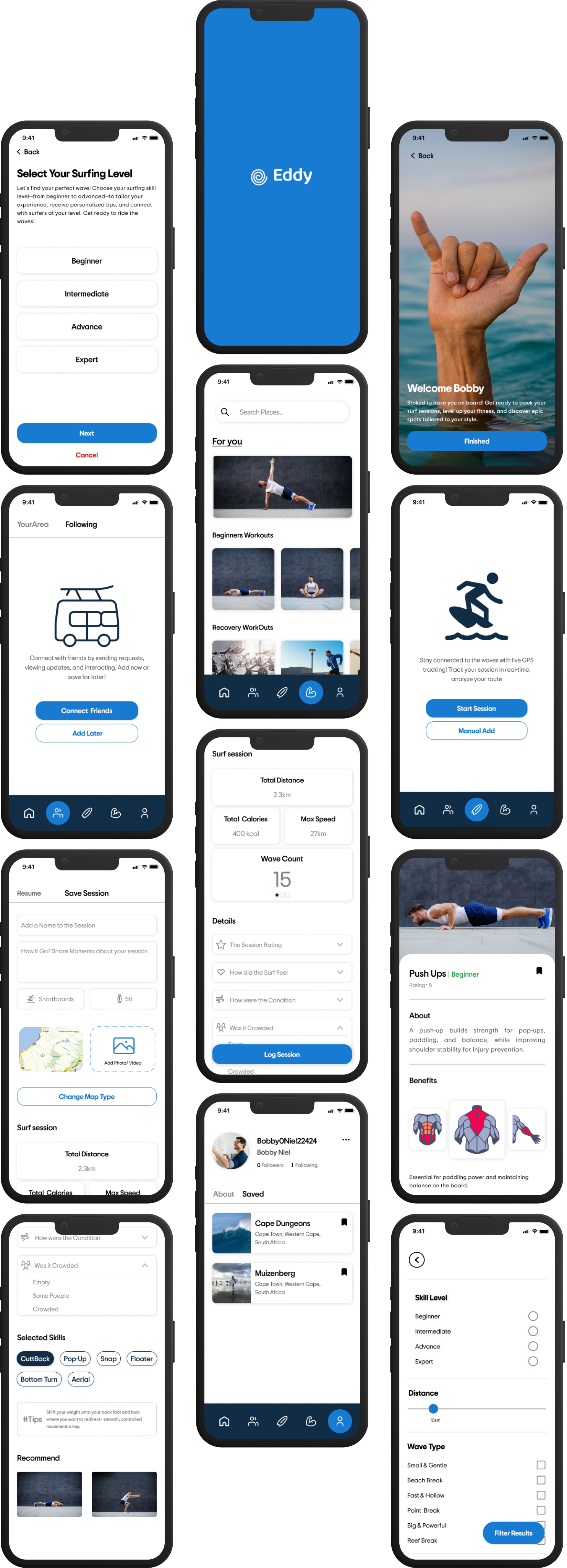 View the prototype ↗
Reflections
Your content here...