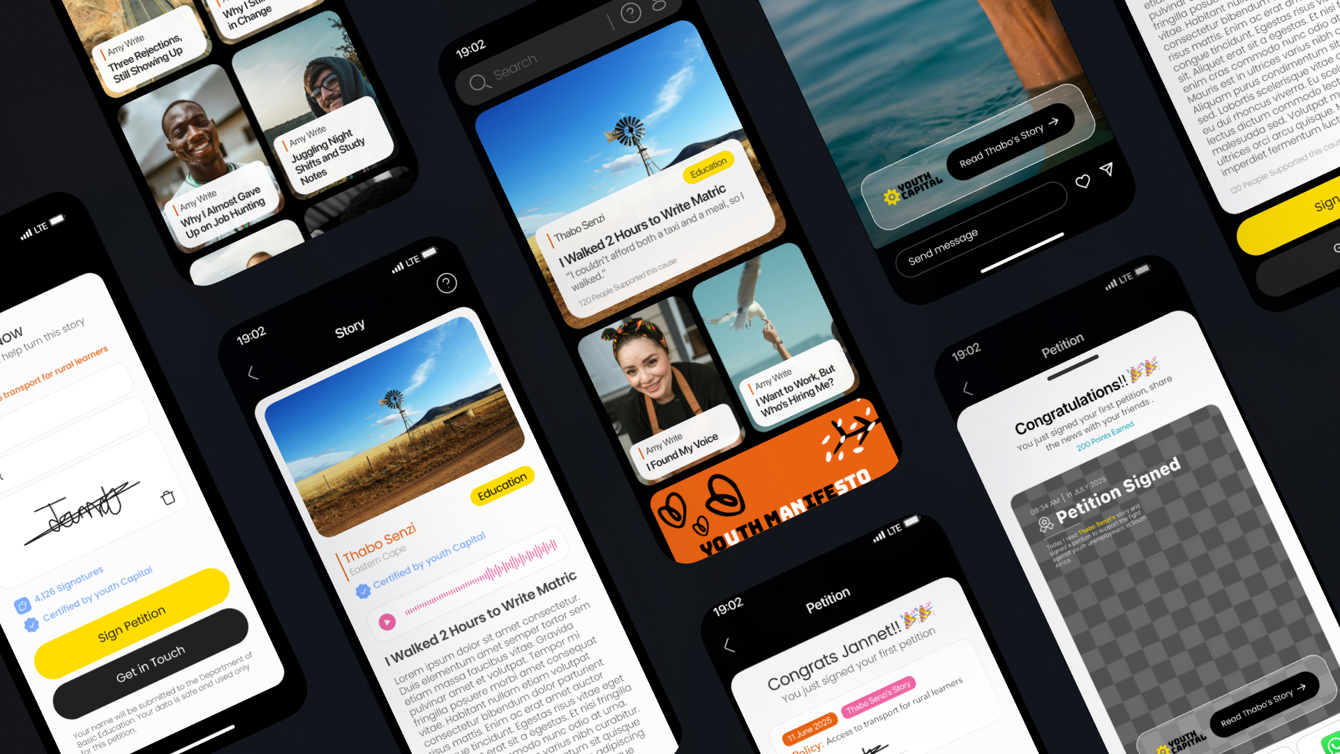


Young people are telling powerful stories, but those stories often don't reach the people who can act on them.
Echo is a progressive web app built with Youth Capital, a South African advocacy group working on youth unemployment. The brief asked for a platform that gets young people to act rather than only read. What we found in research was that the intent already existed — what was missing was a short, credible route from hearing someone's story to doing something about it. Echo is that route: a verified story leads to a petition, signing leads to a share, and the share pulls someone new into the story. I worked on this with George, splitting the interface between us.
01 — Design Brief
What were we asked to make?
Youth Capital is an advocacy group in South Africa working on youth unemployment through research, policy advocacy, and centring young people in the conversation rather than speaking for them. They asked us for a digital platform that encourages young people to get involved in solving youth unemployment, explains advocacy and policy in a way that doesn't feel like homework, and gets users to act rather than only think or talk about the problem.
- Teach users about youth unemployment and advocacy
- Show that everyone is affected
- Encourage real action, not just reading or watching
- Not feel like a boring government activist site
- Be data-light and work on limited devices
- Keep it simple — limited resources
- Onboard users into what advocacy actually means
- Build in gamification to bring users back
- Include a social sharing function showcasing a badge
- Website vs app was still open at kickoff
That last constraint mattered more than it looked. Data-light, works on limited devices, and website-or-app-undecided all pointed the same way, and we settled on a progressive web app — no install, no app store, low data cost, and reachable from a shared link, which the sharing loop depended on anyway.
02 — Approach
How did we approach it?
We treated the brief as a starting position rather than a specification. The client had asked for advocacy education and gamification; research pushed us toward storytelling as the thing that would actually carry both.
03 — Research
What did we discover?
We researched three user groups the brief identified: unemployed young people and students in post-school education, community facilitators who act as trusted intermediaries, and allied organisations — Youth Capital's partners, small business reps and CBO workers. The focus was youth aged 18–34 in urban and peri-urban settings. We ran a short Google Forms survey, two interviews, and an audit of six existing platforms.
The survey
The survey returned five responses, four of them within the 18–34 target range. That is a small sample and I've treated it as directional rather than statistical — no percentages, no claims about the population. What made it useful was how tightly it agreed with the interviews and the audit. Three separate methods pointed at the same behaviour.
The last figure reframed the problem. We had been designing for people who needed persuading to care. Everyone who responded had already done something — signed, shared, attended, volunteered. Asked what would motivate them further, they chose seeing real stories from people like themselves and seeing clear results from their own actions. Asked what would bring them back to a platform, they said rewards, good content, and one respondent simply: if it is fun and entertaining.
One caveat worth stating: the fifth respondent was over 45, outside our target range, and answered dismissively — that young people should stop expecting handouts. It's a minority view in a tiny sample, but it's a reminder that the audience Echo needs to reach includes people who don't accept the premise, and that a platform arguing for youth advocacy is arguing into some resistance.
What the interviews told us
A data analyst working with Youth Capital described the practical wall their outreach hits: universities charge for campus access, so reaching students directly is difficult, and young people without degrees face compounding barriers into both education and employment. On advocacy, the pattern was interest without follow-through — young people express interest and then don't act, for want of information and motivation rather than willingness. They responded well to the idea of unemployed youth sharing their own stories to attract support, while noting candidly that people with resources tend to engage when there's a benefit attached.
A community facilitator made the case for storytelling directly: sharing a story lets others resonate with it, and even where experiences differ, the feelings can be similar enough to create empathy — and empathy is what leads to action. People read stories constantly and learn from them, so real lived experience builds awareness in a way that general information doesn't.
Competitive audit
We audited six platforms working adjacent to this problem — Activate! Change Drivers, amandla.mobi, DoSomething.org, Fridays for Future, GoodWall and Zlto. Each answered a different part of the brief, and together they shaped most of Echo's feature set.
Every survey respondent used WhatsApp, and amandla.mobi reaches South Africans over SMS and WhatsApp in four languages, prioritising low bandwidth.
Decision Data-light PWA, with WhatsApp Status as a first-class share target alongside Instagram Stories.
Petition signing was already the most common action our respondents had taken, and DoSomething.org shows youth prefer quick, tangible actions over abstract messaging.
Decision Sign-a-petition as the primary call to action — an existing habit rather than a new one, completable in seconds.
"Seeing real stories of others like me" was a top motivator, and Activate! Change Drivers spotlights individual young change-makers to inspire others.
Decision Individual named stories carry the feed — one person at a time, never aggregate statistics.
"Seeing clear results of my actions" was equally weighted, and Zlto's activity dashboard shows that a visible sense of progress matters when you're unemployed.
Decision Badges, points and a leaderboard, so contribution is tracked and publicly visible rather than private.
Respondents said rewards and entertainment would bring them back, and GoodWall shows badges and community visibility drive repeat engagement.
Decision Gamified participation built into the profile rather than bolted on as a separate feature.
Fridays for Future unifies local and national action through a strong shared visual identity and downloadable toolkits.
Decision Ready-made share templates, so every user posts something that visibly belongs to the same campaign.
Who are we designing for?
Zinhle represents the user the brief was really about — already sympathetic to Youth Capital, already following along, and still not participating.

Zinhle, 23
"I want to be involved, but sometimes it feels like the movement is happening without me. I wish there was an easy way to see how people are being affected as well as an easy way to act on it."
Goals & Needs
- To feel part of a community making a difference in youth development
- Clear, simple ways to contribute to causes she cares about
- To build confidence navigating civic spaces
Relationship to Youth Capital
- Follows Youth Capital online and resonates with their message
- Feels aligned with the mission but hasn't engaged deeply yet
- Seeks more interactive, personal ways in — micro-actions, gamified participation
04 — Defining Problems
What problems did we identify?
Bridging the gap between experience and action.
Young people living through youth unemployment have the most credible account of it, and the least access to the people who set policy. Meanwhile the people who want to help have no obvious way in. The two sides aren't connected by anything.
Youth Capital's own experience is that young people express interest in advocacy and then don't act on it. The barrier isn't willingness — it's not knowing what to do next, and not having a reason to come back.
The audience is data-conscious and often on limited devices, and Youth Capital's own outreach is blocked by paid campus access. Anything requiring an install, an account-heavy onboarding, or a lot of data loses the user before the first story.
There was also an ethical problem the brief didn't name. Building a platform on stories about hardship risks turning people's difficulties into content. That shaped the concept as much as any research finding did.
05 — Ideation
What did we explore?
The first concept was a three-page progressive web app: a Feed for discovering advocacy stories and petitions, My Campaigns as a dashboard of what you'd signed, and Profile & Points to gamify participation. The mechanism connecting them was a growth loop — after signing, the user is prompted to share, the shared link brings someone directly into the story and its petition, and that person becomes the next sharer.
The revision came from the ethics problem. If Echo simply let anyone post their hardship, it would mine personal trauma for engagement. So we split the product in two: Youth Capital sources, reviews and publishes stories from its existing community networks on an opt-in basis, and the public reads, signs, shares and tracks. A "Verified by Youth Capital" badge carries that trust into the interface, which also solves the credibility problem — users can tell a story is real and part of a broader campaign rather than a scam or clickbait.
How we prioritised
06 — Design Process
How did we turn it into an interface?
George and I split the build roughly in half. He designed the home page and the sign-petition flow; I designed the dropdown menus through to the profile page, plus the badges and leaderboard. The brief, research, concept and structure were shared work.
Information architecture
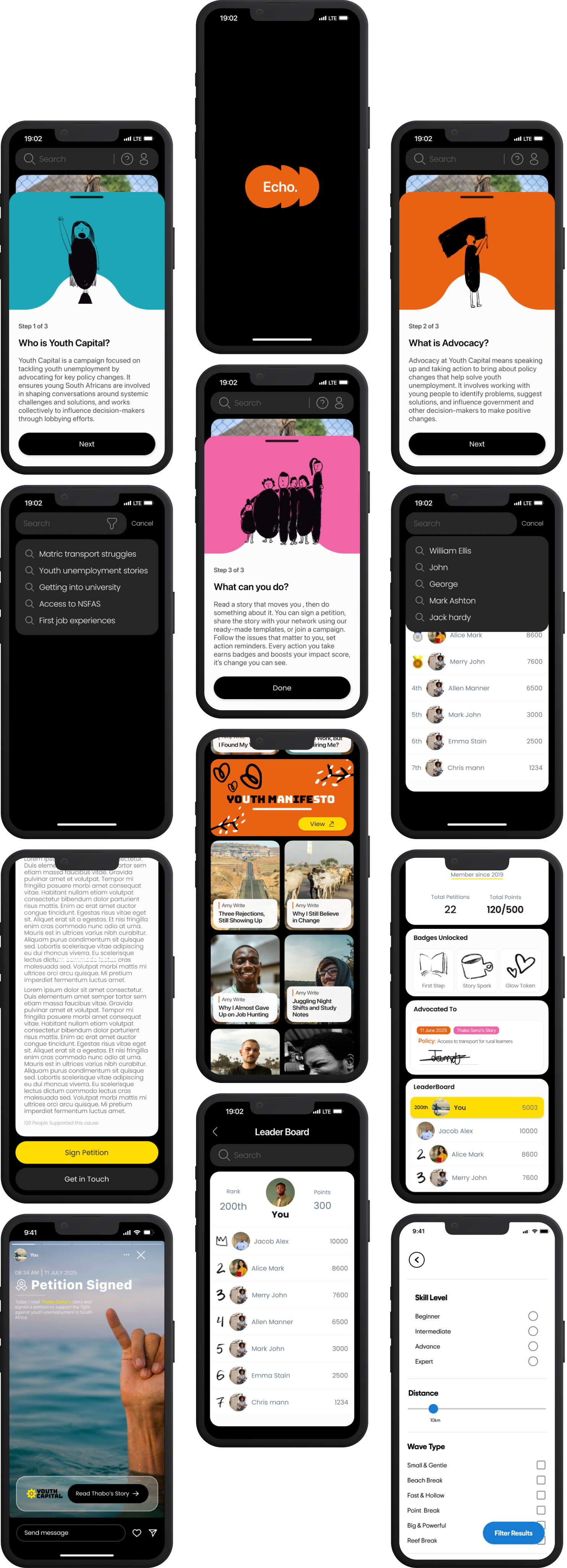
Seven top-level areas: Home Feed, Search & Filters, Story Content, Petitions, Profile, Badges and Leader Board. The Home Feed carries a learn-more pop-up and the Youth Manifesto, so the advocacy explainer sits where new arrivals land rather than behind an onboarding wall they'd skip. Story Content holds the verification marker and the advocacy prompt — the point where a story hands off to an action.
The flow that mattered most
Feed → Story → Call to action → Taking action → Sharing
Profile, badges and leaderboard
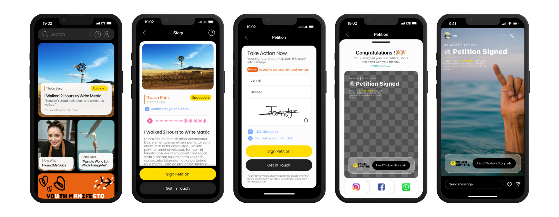
My half of the interface handles the part of the loop that happens after the action. The profile shows petitions signed and recent advocacy, badges are grouped into categories with the story behind each one, and the leaderboard adds rank and placement. The reasoning came straight out of the audit: Zlto and GoodWall both show that a visible sense of progress is what brings people back, and the research kept surfacing the same need — people want to know their action counted for something.
Visual System Choice
Poppins throughout, on a type scale running from 56px headings down to 20px, with line height set at 1.1× the font size. The secondary palette is deliberately bright — green (#98B23F), blue (#1DA6B5), orange (#E96212) and pink (#F065A5) — because the brief was explicit that this should not read as a government activist site, and because a story about unemployment lands differently when the interface around it isn't grim.
07 — Final Design
What does the final design look like?
 View the prototype ↗
07 — Reflection
What did I learn?
[Your reflection here.]